Kingdom
Reach
Pricing
Sign in
Get Started
KingdomReach · Content Intelligence
Top Videos from Riffomonas Project
Content channel
Ranked by total public view count.
Top 15 of this channel's videos we track · public YouTube data only, nothing fabricated.
1
What goes wrong when there's too much data and no context (CC417)
1.2K
views
2
Critique of a time series heatmap published in Nature Microbiology (CC415)
1.0K
views
3
Doing crazy things with your legends in ggplot2 (CC421)
1.0K
views
4
No geoms or raw data: A lesson in data visualization simplicity (CC419)
947
views
5
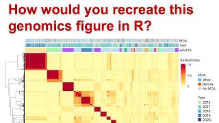
Recreating a set of dendrorgrams, heatmaps, and a stacked bar plot from Nature Cancer (CC423)
858
views
6
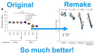
Two methods of creating a jitter dodged slope plot in R with ggplot2 (CC429)
779
views
7
Converting a heatmap into a line plot with ggplot2 in R to improve interpretability (CC416)
748
views
8
Integrating curve fit data to improve the interpretability of dose response visualizations (CC420)
747
views
9
Converting a stacked bar plot to something better (CC427)
692
views
10
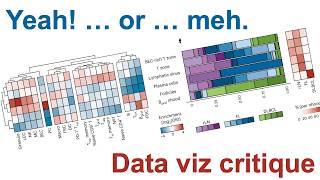
Critique of a faceted heatmap ordered with a dendrogram (CC422)
669
views
11
Leverage the experimental design to improve your data visualizations (CC426)
669
views
12
Representing paired pre/post data in an ordination with arrows using R and ggplot2 (CC428)
653
views
13
How to add a tree to a heatmap with ggplot2 (CC418)
567
views
14
How to align your text with your data visualizations (CC424)
529
views
15
Reducing data viz clutter by integrating multiple panels into one (CC425)
463
views